
The use of an effective color scheme in web design cannot be overstated. Colors have the power to evoke specific emotions and actions among site visitors. In fact, some research indicates that a well-planned color scheme can increase website recognition by up to 80%. Likewise, typography is more than just picking a pleasing font. It’s a pivotal aspect of web design that affects how information is perceived. Thus, he right choice of colors and typography holds the key in creating a compelling user experience. It enhances readability, navigability, and the overall visual appeal.
How Color Psychology Affects Website Visitors
Color psychology plays a subtle yet significant role in how we perceive a website. The link between colors and emotions has been well-documented. For instance, cooler shades like blues and greens often evoke feelings of tranquility and trust, while warmer hues like reds and oranges are associated with passion and energy. This understanding can then aid in shaping your website’s user’s emotional response.
Choosing the Right Color Scheme for Your Brand
Selecting an appropriate color scheme for your website involves balancing the overall visual appeal with the psychological impact of colors, all while staying true to your brand’s identity. A color scheme represents your brand across all platforms, so it’s essential to pick a combination that accurately portrays your brand’s values and mood.
Importance of Typography in User Experience
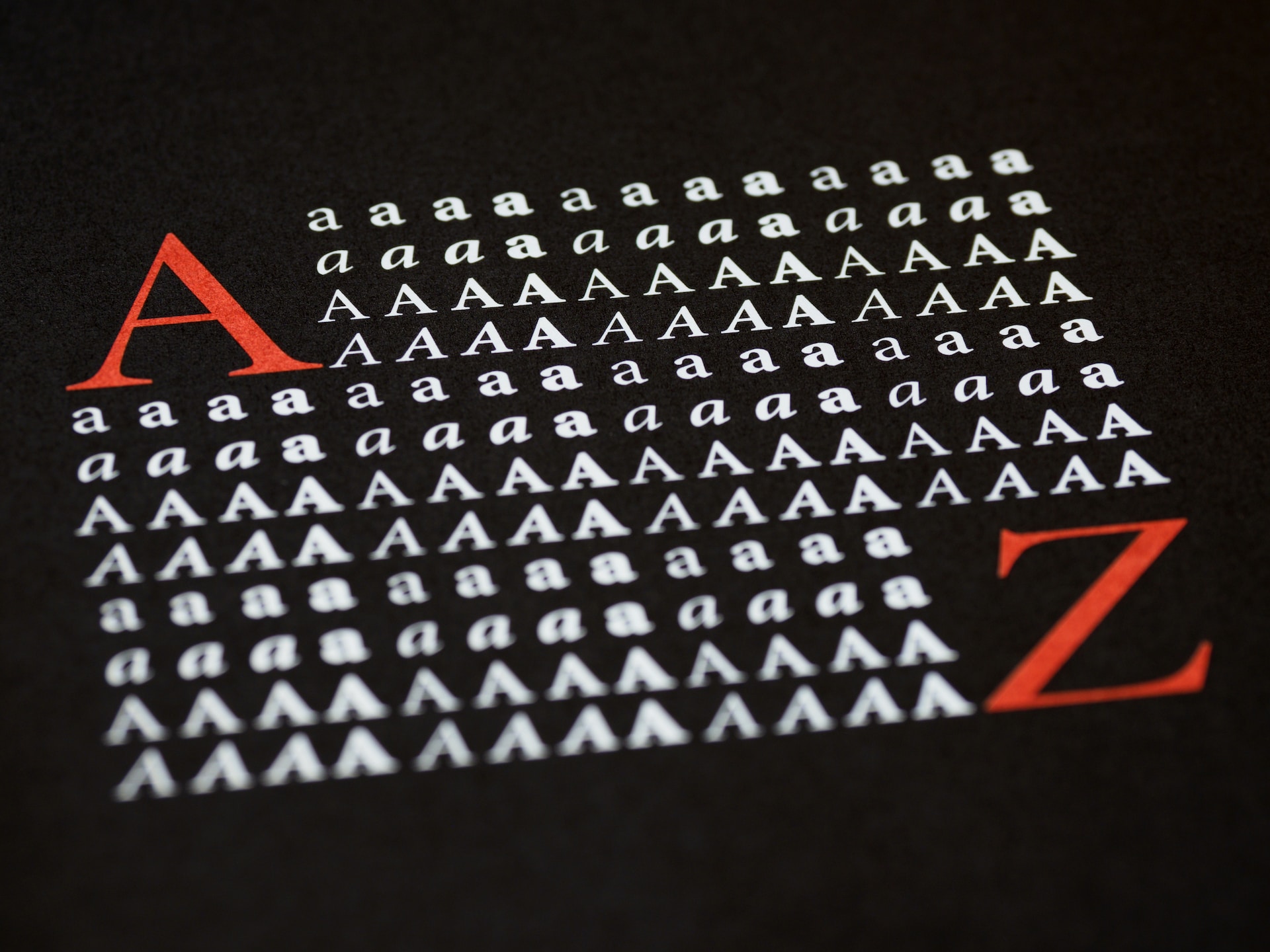
Understanding typography is crucial for anyone seeking to deliver seamless user experience in web design. Typography masterfully guides users through the flow of information on your website. It sets the tone, evokes emotion, and even influences the way users interact with the content. Web design utilizes three primary types of fonts:
- Serif (e.g., Times New Roman): generally used for larger blocks of text due to their readability
- Sans serif (e.g., Arial): popular for headlines and short text
- Script: often used for logos and call-to-action elements
Readability and Legibility Considerations
Quality web design prioritizes readability and legibility. So, the chosen typography should be easy to read on various devices and make for a pleasant browsing experience. Stick to a limited number of fonts and ensure contrast between text color and the background.

Harmonizing Color Scheme and Typography
The visual appeal of your site determines its success, and merging harmonious colors with appropriate typography is key. Whether you’re designing a professional or playful site, the rules remain the same: aim for contrast, readability, and visual interest.
- Create a Consistent Design Language: Design consistency is crucial in keeping the user engaged and promoting a memorable brand experience. This can be accomplished by using a limited color palette for uniformity and typography that complements your design theme.
- Match Fonts to Colors for Visual Harmony: Visual harmony plays a significant role in setting the mood and tone of your website. Try combining warm colors with soft, rounded fonts and using cool colors with more squared, sharp fonts.
- Use Contrast and Hierarchy to Enhance Readability: Usecontrasting colors for your text and your background. You can also create visual hierarchy through the size, weight, and positioning of typefaces.
Popular Color Schemes and Typography Combinations
In web design, choosing a visually appealing and user-friendly color scheme and typography combination can make or break the overall site experience. So, here’s an overview of three popular color and typeface combinations that work particularly well
1. Monochromatic Color Palettes with Bold Typography
Monochromatic color schemes are those made up of different tones, shades, and tints within a specific hue. When combined with bold typography, such as a strong, sans serif typeface, they can create a powerful visual impact. Simply select a predominant color and explore its different shades for the background, the buttons, or even the type color.
2. Analogous Color Schemes with Minimalist Typography
Analogous color schemes are made up of colors that are next to each other on the color wheel. This scheme creates a rich, yet harmonious look, especially with the use of minimalist typography style, such as a simple, thin, sans-serif font. This color and typeface combo then results in a clean, modern, and calming website design.
3. Complementary Colors and Playful Typography
Complementary color schemes are those that use colors directly across from each other on the color wheel. These colors provide high contrast and can create lively, vibrant designs. Complement that with playful typography, such as handwritten or unusual fonts, and you’ll achieve a unique and dynamic design that’s sure to attract attention.

Incorporating Brand Identity in Colors and Typography
The choice of colors and typography goes further than just pure aesthetics in web design. These elements act as essential visual cues that facilitate a profound connection between the brand and its audience. Here’s how it works:
Reflecting Brand Personality Through Design Elements
Your chosen color scheme and text style should match the character and personality of the brand. For instance, a brand promoting eco-friendly products may lean towards earthy, natural hues, while a tech company might prefer sleek, modern typography and bold colors.
Using Fonts and Colors to Reinforce Brand Recognition
Consistency in using specific colors and fonts can enhance brand recognition. Brands like Coca Cola and McDonald’s have utilized color and typography to their advantage to become universally recognized symbols.
Aligning the Design Choices with Brand Values
The design elements, whether it’s a color scheme or typeface, should align with your brand values. Bright, bold colors may suggest innovation and energy, while traditional typography may imply reliability and trust. Always ensure to coordinate your design choices with your existing brand identity.
Conclusion
Maintaining a consistent and coherent design language is crucial for successful web development. It creates an engaging user experience, ensures that your site conveys a professional and trust-worthy image, and strengthens your brand identity. When selecting color schemes and typography, it’s essential to:
- Ensure Consistency: Keeping color schemes and typography consistent throughout a site creates a sense of harmony and reinforces brand recognition.
- Prioritize Readability: Websites should be easy to read. A proper contrast between the texts and the background is essential.
- Express Your Brand identity: Your color scheme and typography should communicate your brand’s personality.
Remember, designing a website is a strategic process that requires careful thought and planning to balance aesthetics and functionality effectively.