
In today’s digital world, it’s essential for businesses to have a responsive and user-friendly website. With the ever-increasing use of smartphones, tablets, and other mobile devices, designing for different screen sizes has become crucial. Here, we will explore the importance of designing for different devices and screen sizes and provide you with some tips to ensure your website looks great on every screen.
Why is Designing for Different Devices and Screen Sizes Important?
1. User Experience (UX)
User experience plays a significant role in the success of any website. A website that is not optimized for different devices and screen sizes can lead to a poor user experience. Users may struggle to navigate through the website, read the content, or interact with the elements, resulting in frustration and a higher bounce rate. By designing with responsiveness in mind, you can ensure a seamless and enjoyable user experience across all devices.
2. Search Engine Optimization (SEO)
Search engines prioritize mobile-friendly websites in their rankings. If your client’s website is not optimized for different devices, it may lose visibility on search engine result pages (SERPs), impacting its overall organic traffic and potential conversions. By designing responsively, you can improve the website’s SEO and increase its chances of ranking higher on search engines.
3. Brand Consistency
Consistency is key when it comes to branding. A website that looks different on various devices can dilute the brand identity and create confusion among users. By designing for different devices and screen sizes, you can maintain a cohesive brand experience across all platforms, reinforcing your client’s brand identity and increasing brand recognition.
Tips for Designing for Different Devices and Screen Sizes
1. Adopt a Mobile-First Approach
Start your design process by focusing on the mobile version of the website. This allows you to prioritize the most critical content and functionality and ensures a seamless experience on smaller screens. Once the mobile design is finalized, you can progressively enhance it for larger devices.
2. Use Responsive Design Techniques
Responsive design is the practice of creating flexible layouts and fluid grids that adapt to different screen sizes. This approach allows your design to seamlessly adjust and reposition elements based on the device being used. Use media queries to apply specific styles or layouts for different breakpoints, ensuring optimal display on each device.
3. Prioritize Content
With limited screen real estate, it becomes essential to determine what content is most important and display it prominently. By focusing on the key messages and functionalities, designers can create a responsive layout that adapts seamlessly to various devices. Prioritizing content involves considering factors such as readability, relevance, and accessibility. It is important to make sure that essential information is easily accessible and that the user’s attention is directed towards the most important elements on the screen.
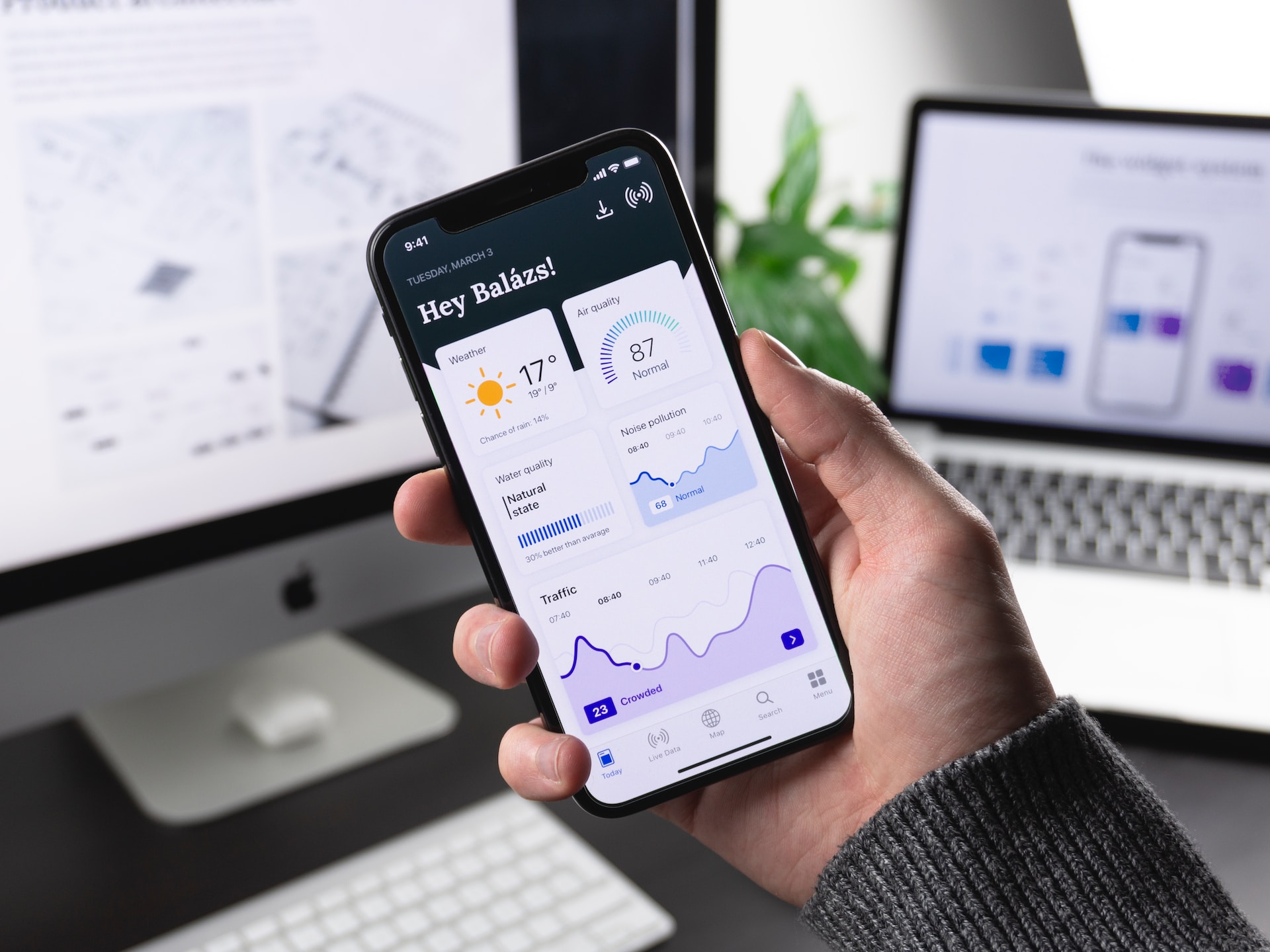
4. Optimize Images and Media
Large images and heavy media files can significantly impact the loading time of a website, especially on mobile devices with slower internet connections. Optimize images by compressing them without sacrificing quality, and consider using lazy loading techniques to load media files as users scroll down the page.

5. Test Across Devices and Screen Sizes
To ensure a consistent experience, thoroughly test your designs across a range of devices and screen sizes. Use emulators, simulators, or physical devices to identify any issues and make necessary adjustments. User testing can also provide valuable insights into how real users interact with the website on different devices.
6. Simplify Navigation
When it comes to mobile devices with smaller screens, it is essential to prioritize the most important navigation elements and condense the menu options to avoid clutter. Use collapsible menus or hamburger icons, which allow users to access additional navigation options when needed. Additionally, using clear and concise labels for navigation buttons can help users understand their purpose easily. For larger screens, designers have more space to work with. However, it’s still important to keep the navigation straightforward and intuitive.
7. Communicate the Benefits
When presenting your designs to clients, emphasize the benefits of designing for different devices and screen sizes. Highlight the improved user experience, increased search engine visibility, and enhanced brand consistency. By effectively communicating these advantages, you can gain client buy-in and ensure the implementation of responsive design practices.
The Bottom Line
Designing for different devices and screen sizes is no longer optional; it’s a necessity. With a responsive design, you can provide an optimal user experience, increase your website’s visibility in search engine results, and cater to the growing number of mobile users. By adopting a mobile-first approach, using responsive design techniques, and following the tips mentioned above, you can ensure your website looks great on every device and screen size. So, start designing for different devices today and stay ahead in the digital world.