
In the world of web design, creating a visually appealing and user-friendly website is crucial. Not only does it attract visitors, but it also keeps them engaged and encourages them to explore further. One effective way to achieve this is by implementing visual hierarchy in your designs.
What is Visual Hierarchy?
Visual hierarchy is the arrangement and presentation of elements on a web page, which guides users to easily find and understand the content. It helps create a sense of order, directing the users’ attention to the most important elements first. This is especially important when dealing with clients and presenting your designs effectively.
So how can you use visual hierarchy to improve your website designs? Let’s dive in.
1. Prioritize Information
When designing a website, it is essential to identify the key information that you want your users to focus on. Place the most important content or message at the top of the page, where it will be immediately visible. Use larger font sizes, bolder colors, or prominent imagery to draw attention to these elements. This ensures that your clients’ most critical messages are effectively communicated.
2. Use Color and Contrast
Color plays a vital role in visual hierarchy. Use contrasting colors to make certain elements stand out from the rest. For example, use a bright color for call-to-action buttons to make them more noticeable. Additionally, consider the psychology of colors and how they can evoke specific emotions or actions from your users. The right color choices can greatly influence the effectiveness of your designs.
3. Size and Scale
By varying the size and scale of elements, you can create a visual hierarchy that guides users through your website. Larger elements tend to attract more attention, so use this technique to highlight important sections or key messages. This helps clients to understand the flow of information and directs their focus to the most relevant content.
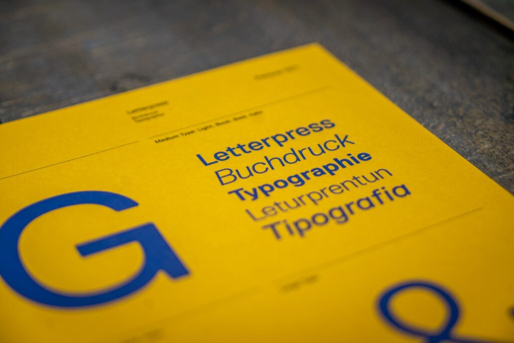
4. Typography
Choosing the right typography can greatly impact the visual hierarchy of your website. Use different font sizes, weights, and styles to emphasize important headings, subheadings, and body text. Ensure that the typography is easy to read and complements the overall design aesthetic. Consistency in typography across the website will also contribute to a cohesive visual experience.
5. White Space
Don’t underestimate the power of white space. It helps create a sense of breathing room and improves overall readability. Use white space strategically to separate different elements and direct users’ attention to specific areas. This allows clients to easily digest the content and prevents them from feeling overwhelmed.
6. Visual Cues and Directional Elements
By strategically placing elements such as arrows, lines, or images, designers can direct users’ attention to specific areas or actions. For example, a prominent call-to-action button placed at the top of a webpage can visually signal its importance and guide users towards taking a desired action. Similarly, the use of contrasting colors, larger font sizes, or bold typography can help create visual hierarchy and draw attention to key information or sections.

7. Focal Points
Using focal points is a crucial technique when employing visual hierarchy to effectively guide users on a website. By strategically positioning elements with high visual weight, such as a hero image or a prominent product image, and combining them with attention-grabbing headlines, designers can direct users’ attention to the most important information or call-to-action. For example, a website selling smartphones might use a captivating hero image of their latest model, placing it prominently on the page with a compelling headline.
8. Consistency
By maintaining a consistent design, layout, and navigation, users can easily navigate through different pages without confusion. For example, a website that uses the same color scheme, typography, and placement of elements across all its pages ensures a cohesive user experience. When users encounter familiar patterns and elements, they can quickly understand how to interact with the website, reducing the learning curve and enhancing usability.
9. Navigation
An intuitive and well-organized navigation menu is crucial for guiding users throughout your website. Clearly label each menu item and place them in a logical order. Consider using visual cues such as arrows or icons to assist users in understanding the navigation flow. This ensures that clients can easily find what they’re looking for and navigate through your designs effortlessly.
The Bottom Line
In conclusion, visual hierarchy is an important aspect of web design that can greatly enhance the user experience and effectively present your designs to clients. Remember, understanding your target audience’s needs and preferences is key. By implementing visual hierarchy techniques, you can create designs that not only attract and engage users but also effectively communicate your clients’ messages. So go ahead, embrace the power of visual hierarchy and take your web design proposals to the next level.